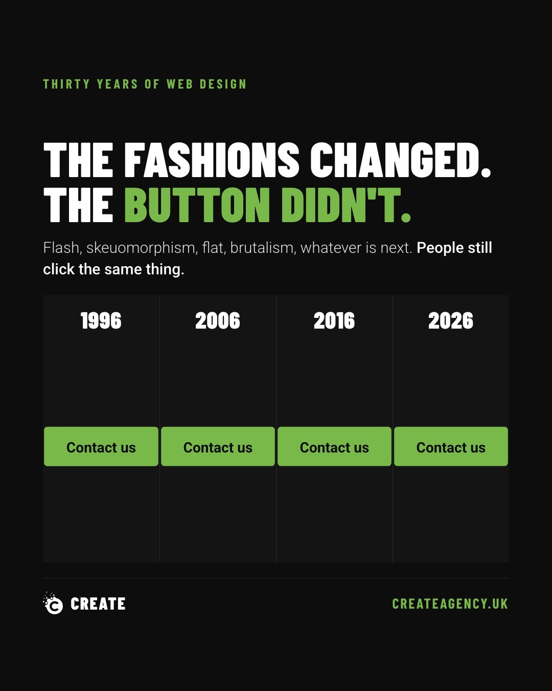
Web design has cycled through Flash intros, drop shadows, skeuomorphism, flat design, material design, brutalism, and at least four separate opinions on whether a button should look like a button. Trends come and go. But on a small business website, the most clicked thing on the page has never moved. It's the bit that says what happens next: call us, get a quote, book now, buy.
We raise this because redesigns tend to bury exactly that. The new site looks sharper. The photography is better. The animation is genuinely lovely. And the enquiries drop. We've seen it happen enough times to know it's rarely bad luck. It's nearly always the same handful of mistakes, repeated by different designers in different years.
The Button Moved Below the Fold
Most traffic to a small business site now arrives on a phone. If the call to action sits below the fold on mobile, a large chunk of visitors never see it at all. They scroll past a hero image, a strapline, maybe a video, and give up before reaching the one thing that would have turned them into a customer.
This is an easy trap to fall into during a redesign, because desktop mockups look fine. Nobody checks what the page looks like on a five-inch screen with one thumb doing the scrolling. We always test this specifically, because it's the difference between a beautiful site and a site that pays for itself.
It Stopped Looking Like a Button
Somewhere along the way, buttons became unfashionable. Ghost buttons, text links dressed up as buttons, buttons with no fill and a thin outline that vanishes against a busy background. All of it in service of a cleaner aesthetic.
The problem is that people scan websites, they don't read them. A button that doesn't look like a button doesn't get clicked, because the brain doesn't register it as something to click. Design should make the obvious thing more obvious, not more tasteful. If a visitor has to think for even half a second about whether something is clickable, that's a lost enquiry.
The Copy Went Soft
"Get a free quote" tells someone exactly what will happen if they click. "Discover more" tells them nothing. Somewhere in the redesign process, direct calls to action get rewritten to sound more polished, and in doing so they lose the one job they had.
This usually isn't malicious. It happens because copy gets reviewed for tone and brand voice, and nobody's specifically checking whether it still converts. But a call to action isn't a place for cleverness. It's a place for clarity.
Too Many Competing Calls to Action
A redesign often adds features: a newsletter signup, a live chat widget, a booking form, a phone number, a contact form, all fighting for attention on the same page. Four calls to action competing with each other is, in practice, the same as having none. Visitors freeze rather than choose.
We've worked on plenty of sites for clients across our portfolio where the fix wasn't adding more, it was stripping back to one clear primary action per page, with everything else secondary. It's a harder discipline than it sounds, because everyone internally wants their thing to be the priority.
The Phone Number Became an Icon
This one is small but it matters. Swapping a visible phone number for a little handset icon might look tidier, but an icon doesn't tell anyone you're twenty minutes up the road, based in Devon, or reachable right now. For local businesses in particular, a real phone number builds trust an icon simply can't.
Ask the Right Question Before Signing Off a Redesign
If somebody is pitching a redesign, there's one question worth asking before agreeing to anything: what happens to enquiries. Not what happens to the look, the load speed, or the brand consistency. Enquiries.
If nobody involved can answer that question with confidence, it isn't a redesign. It's a decorating job, and it's likely to cost more in lost business than it saves in aesthetics.
We've been building and rebuilding websites for 30 years, long enough to have made most of these mistakes ourselves early on and learned to design around them since. If a redesign is on the cards and enquiries matter more than trends, it's worth talking it through before any wireframes get drawn. You can book a call with us and we'll tell you straight whether the plan will grow the business or just repaint it.