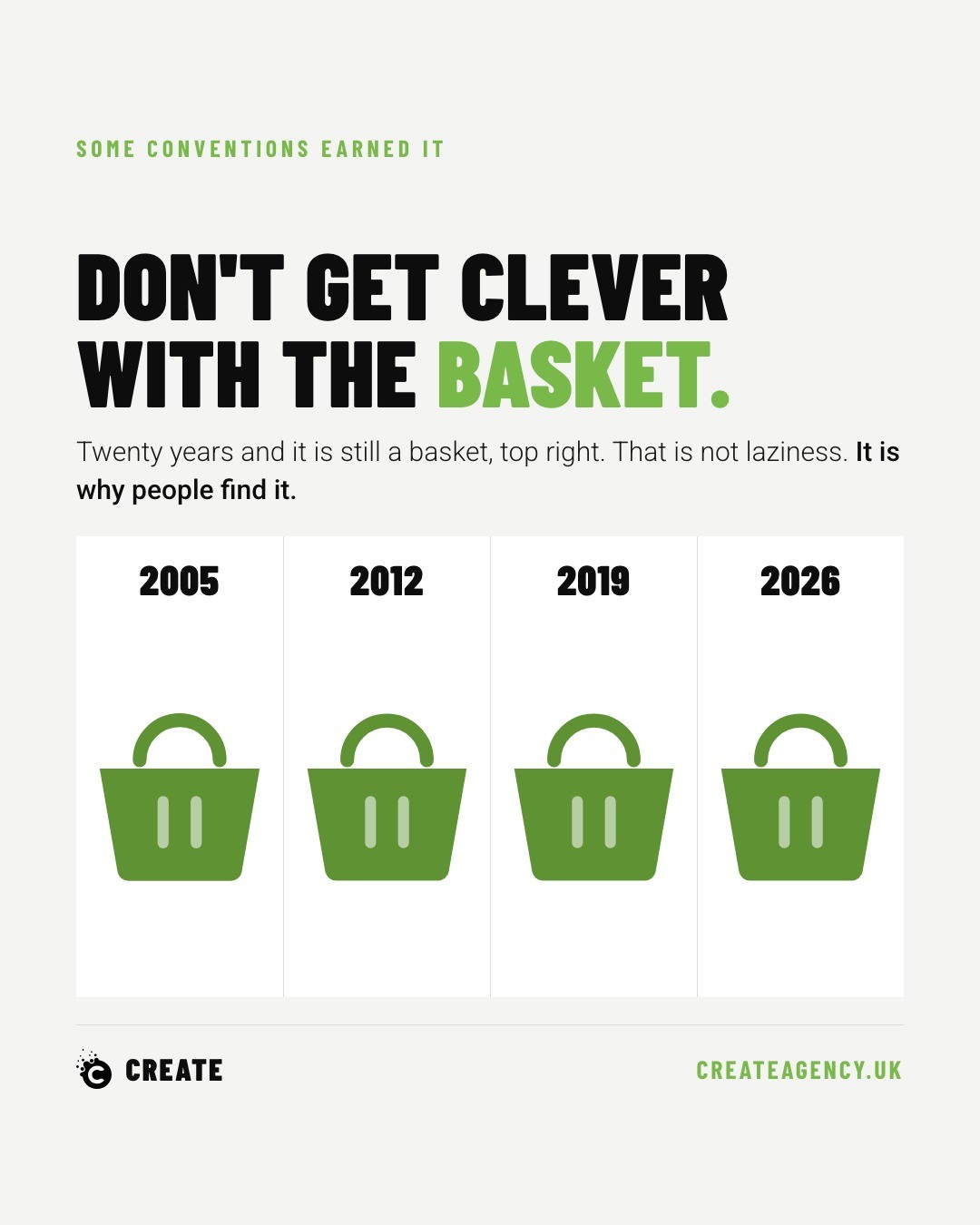
The shopping basket has lived in the top right corner of online shops for roughly twenty years. It wasn't always there. Amazon had it sitting in the middle of the navigation as late as 1999. Through the 2000s it drifted rightward, enough shops followed, and the position won. Not because it was clever, but because shoppers stopped having to hunt for it.
Every so often, someone decides to improve on that. A minimal outline icon nobody quite recognises. A slide-out drawer that conceals the running total. A basket relocated to the bottom of the page because it balances the layout better on a mood board somewhere. Conversion rate quietly drops, because shoppers were never learning that particular website. They were using the one already installed in their heads from every other site they've bought from.
We see this pattern constantly in ecommerce projects: a client wants their site to feel distinctive, and the instinct is to redesign the parts shoppers touch most often. That instinct is usually pointed at the wrong target.
The Plumbing Isn't Where Originality Pays
There's a difference between a shop that feels distinctive and a shop that behaves unpredictably. The first comes from product photography, tone of voice, brand styling, the parts a customer actually wants to spend time looking at. The second comes from moving the furniture around in a room someone already knows how to walk through.
When we audit underperforming ecommerce sites, the drop-off points are rarely mysterious. They cluster around the same handful of decisions: an unfamiliar basket icon, a checkout that hides costs until the last screen, an account wall in front of a twelve pound purchase. None of these are design failures in the aesthetic sense. They're failures of respect for how someone actually shops online.
The Costs Customers Refuse to Discover Late
Delivery charges are the clearest example. If the total cost only appears at the final step of checkout, that's the single biggest cause of abandoned baskets, and it's been true for as long as we've been building ecommerce sites. Shoppers will tolerate a delivery fee. They won't tolerate finding out about it after they've mentally committed to a purchase.
The fix isn't complicated. Delivery cost and timescale belong on the product page, not three clicks deeper into the funnel. It costs nothing to display and it removes the single most common reason someone closes the tab.
Guest Checkout and the Twelve Pound Problem
Forcing account creation before checkout is one of those decisions that makes sense in a boardroom and none at all at the point of sale. A shopper buying a twelve pound item has no interest in setting a password, confirming an email, and remembering another login for a brand they may never buy from again.
Guest checkout exists because the alternative is losing that twelve pounds, along with whatever goodwill might have brought that customer back later. We'd rather capture the email address after the sale, through a simple follow-up, than lose the sale entirely trying to capture it before.
A Visible Human Behind the Shop
The last convention worth keeping is easy to overlook: a visible, easy way to reach a real person. Live chat, a phone number, a contact page that isn't buried in the footer. Plenty of people will not hand over money to a shop that looks like nobody is actually behind it.
This matters more, not less, as more of the buying journey becomes automated. A shopper hesitating over a purchase decision wants to know that if something goes wrong, there's a human on the other end. Its absence reads as risk, and risk kills conversion faster than almost anything else on the page.
Boring Plumbing, Confident Brand
None of this is an argument against having a strong point of view in ecommerce design. It's an argument for putting that point of view where it earns something: photography, copywriting, the story the brand tells. The basket, the checkout flow, the delivery information, these are the plumbing, and plumbing that behaves exactly as expected isn't a lack of imagination. It's a decision to get out of the customer's way.
We've built and audited enough ecommerce sites to know where the real gains sit, and it's rarely in reinventing the parts nobody notices when they work. If a site's conversion rate has been sliding and the redesign brief keeps drifting toward the basket icon rather than the product pages, it might be worth a second opinion. Book a call and we'll tell you plainly where the friction actually is.