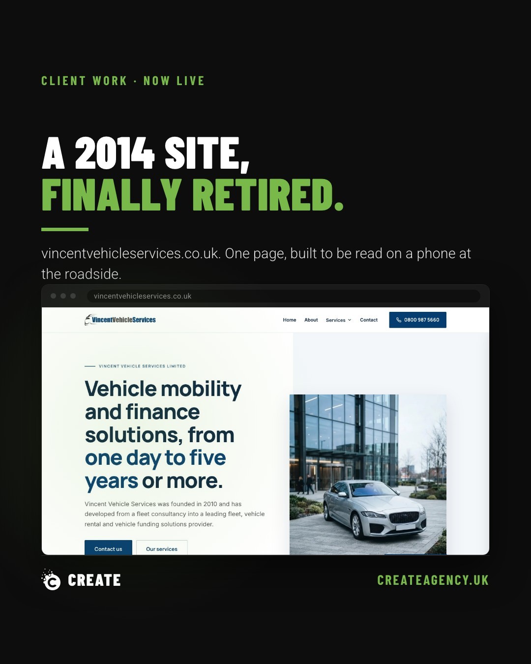
Vincent Vehicle Services has a new website. It replaces a WordPress install from 2014, and it is one page long. That was not an easy sell internally, and it will not be an obvious choice to anyone who assumes more pages means more SEO value or more professionalism. In this case, one page was the right call, not the cheap one.
We want to walk through why, because the decision says more about how we think about web projects than it does about this particular client.
What People Actually Want From a Vehicle Services Site
Anyone landing on vincentvehicleservices.co.uk is usually after one of three things: what the business does, whether it covers their area, and how to get in touch. That is it. There is no browsing journey, no comparison shopping across a dozen service pages, no reason to click through a menu structure built for a business ten times the size.
Splitting three answers across nine pages does not make a site look bigger or more established. It makes those three answers harder to find. Every extra click is a chance for someone standing at the side of a road, phone in hand, engine making a noise it shouldn't, to give up and ring someone else instead.
The old 2014 WordPress site had accumulated the usual sprawl: an About page, a Services page, sub-pages under Services, a Contact page, probably a blog nobody had touched in years. None of that was wrong when it was built. It is wrong now, for this business, on this brief.
Building for Cold Hands at the Roadside
We designed the new site around a specific, slightly uncomfortable image: someone reading it on a phone screen with cold hands, possibly in bad weather, wanting an answer fast. That is not a metaphor we made up to sound clever. It is the realistic condition under which a huge proportion of vehicle services enquiries actually happen.
That constraint shaped everything. Information appears in the order people need it, top to bottom, no hunting through a navigation bar. Contact details are close to hand, not buried three clicks deep. The whole thing loads fast and reads cleanly on a small screen, because nobody in that situation is opening it on a desktop monitor with good lighting and a cup of tea.
A single well-ordered page, built properly, will outperform a scattered multi-page site for this kind of business every time. Not because it is cheaper to build (it isn't necessarily), but because it matches how people actually behave when they land on it.
Why the First Version Got Rejected
Here is the part we are happy to admit publicly: our first attempt at this site was rejected, and it deserved to be.
The brief we set ourselves was that this could not simply be another one of our template builds with the colours swapped out. The first version was exactly that. It looked fine. It was competent. It was also generic in a way that would have worked for a plumber, a locksmith, or a dozen other local trades with barely a word changed.
That is a trap that is easy to fall into on smaller sites, where the temptation is to reuse a proven structure and move fast. It is also exactly the wrong instinct for a one-page site, where every section has to earn its place because there is nowhere to hide filler content. With no pages to spread things across, the single page has to be right.
The second attempt started from the actual brief again: who is this business, who are they trying to reach, and what does someone standing on a verge with a broken-down car actually need to see in the first five seconds. That version earned its own structure, rather than borrowing one from somewhere else.
What This Means for Small Trade and Service Businesses
Vincent Vehicle Services is not a unique case. Plenty of local trade and service businesses are still sitting on ten-year-old WordPress builds with page counts that made sense a decade ago and don't any more. The instinct to add pages as a business grows is understandable. It is not always the right move.
The question worth asking is not how many pages a site should have. It is what the person arriving actually wants, and how quickly the site gets them there. Sometimes that is a full multi-page structure with service pages, location pages, and case studies. Sometimes, as here, it is one page, in the right order, built to work on a phone with cold hands.
If a website is doing more work than the business behind it needs, or less, it is worth a proper look at our services and a conversation about what actually fits. We'd rather build the right thing than the expected thing, and we're happy to say when our first draft wasn't it.