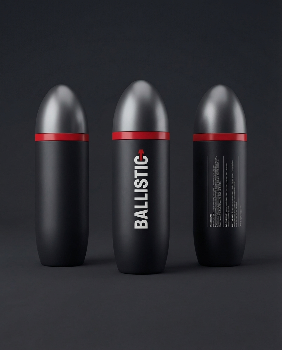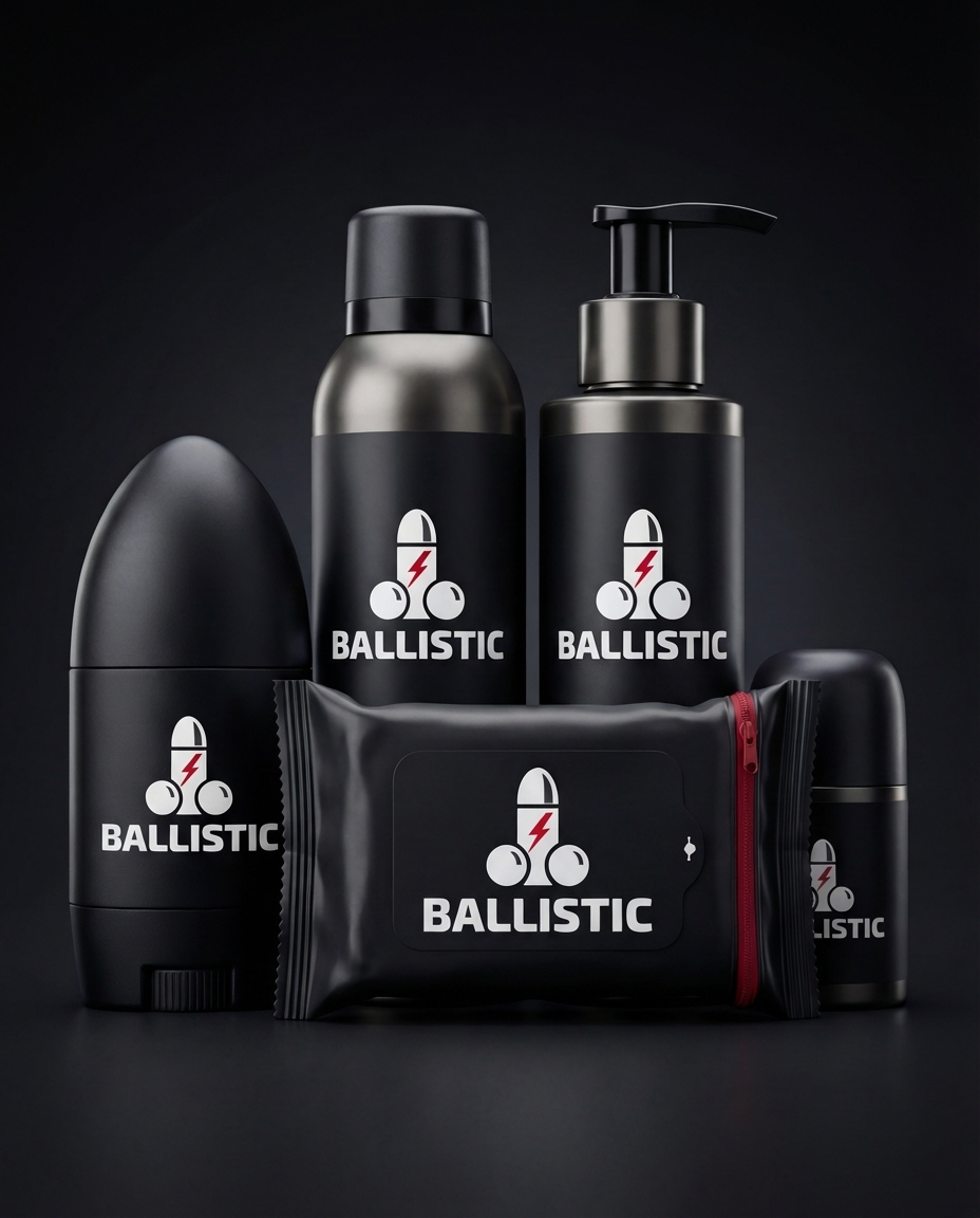
Some projects arrive with a brief that practically writes itself. A new men's grooming brand, built from nothing, with a clear visual language (black, red, no equivocation), and a client who knows exactly what they want to say. This is one of those projects, and we're currently in the thick of it.
Men's grooming is a crowded market. Most brands in the space either go clinical and minimalist or try to borrow equity from heritage shaving culture. The interesting space (the one worth building in) is somewhere more direct. Strong colour. Clear personality. A brand that doesn't need to explain itself at length on the back of a bottle.
We're not announcing the client yet. What we can talk about is the process, because it's a good example of what full brand development actually involves when it's done properly.
Brand Direction Comes Before Everything Else
Before anyone opens a design application, we work out what the brand actually stands for. Not in a values-workshop-with-sticky-notes sense: in a practical, visual, and tonal sense. Who is this for. What do they already buy. What does this brand say that existing options don't. What does the packaging look like on a bathroom shelf next to the competition.
For this project, the answers shaped everything downstream. The decision to commit to a high-contrast palette (deep black, sharp red) wasn't an aesthetic whim. It came from understanding the target customer and the retail context this brand needs to work in.
Packaging Design Is Brand Design
With consumer product brands, packaging isn't a separate workstream that comes after the brand is finalised. It is the brand, at least for the customer picking it up for the first time. We treat packaging concepts with the same rigour as the core identity work: typography, finish, hierarchy, how the product reads at distance versus in hand.
This brand has attitude, and that attitude has to hold up at every scale. A logo that works at 300mm needs to work at 30mm. A colour story that lands on a hero product image needs to translate to a secondary SKU without looking like an afterthought.
Digital Presence Has to Extend the Identity, Not Dilute It
Once the brand language is established, the digital work becomes considerably more straightforward, but only if the brand foundations are solid. A brand with genuine clarity translates well to screen. The visual grammar is already set; the job is to apply it coherently across the website, product pages, and any campaign material.
For a product brand launching in 2025, the website is the shop window, the press kit, and often the primary retail channel simultaneously. It needs to do a lot of work without looking like it's trying too hard. Clean architecture, fast load times, and a visual presentation that makes the product look like it belongs in a premium context.
Why Start-from-Scratch Brand Builds Matter
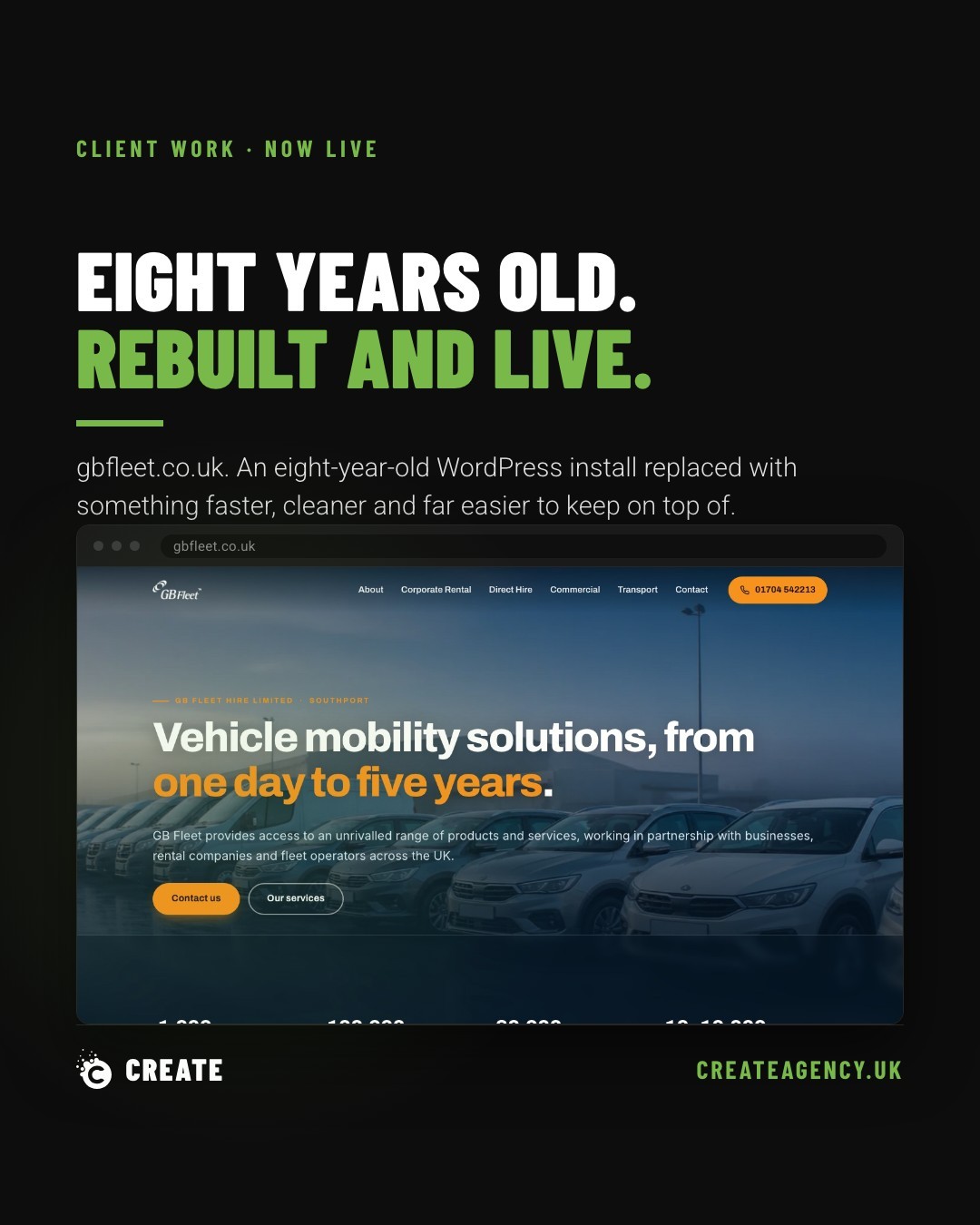
A lot of the work we do involves improving or evolving something that already exists: a website that needs modernising, an SEO strategy that needs a proper foundation, a paid media account that's been left to drift. That work is valuable and we do it well.
But there's something particular about a ground-up brand build. Every decision is intentional. Nothing is inherited from a previous designer's bad choices or a brief that's been diluted over three internal reviews. The brand either works or it doesn't, and the accountability is clear.
This men's grooming project is a reminder of why we got into this in the first place. It's collaborative, it's visual, it demands genuine thinking, and it results in something that exists in the world and either stands out on a shelf or it doesn't.
More detail on this project will follow once the brand is ready to be seen publicly. In the meantime, if you're building something from scratch (a product brand, a new venture, or a business that's outgrown its current identity), take a look at our services to see how we approach brand, web, and digital as a connected whole.